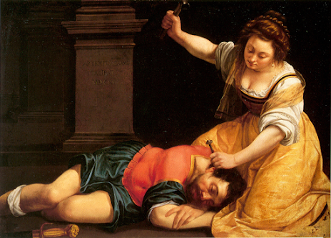
Artemisia Gentileschi, 'Jael and Sisera', c.1620


My eye firstly notices the hand wielding the hammer above the unsuspecting man's head. Gentileschi is depicting a new and particularly horrible kind of weapon here instead of the huge sword she gave Judith to slice Holofernes' head off in 1620. The tent peg seems all the more violent, especially as the viewer is looking at the split second before the deed has been committed. Moreover, the gaze of the women (Jael) is focused and calm, making the piece seem unnerving. This is not a moment of hesitation but a snapshot of action - the woman has made up her mind and will commit to this murder. The viewer can only imagine how Gentileschi would have depicted the bloody aftermath, in her usual violent and tenebristic way. The fact that the artist has signed her name in the tomb-like stone above the man is significant - she is signing his life away in this painting, sending him swiftly to the grave. 

The body of the man (Sisera) is also interestingly depicted. He lies in a rather effeminate way, resting his head on his arm in relaxation and deep sleep. The positioning of his legs with the rumpled drapery around them could almost be those of a woman and although Gentileschi has represented his sword in the foreground, we do not need that symbolism to see him as unmanned and emasculated. The way that he is tucked up close to the woman suggests a loving relationship, or an almost mother and son bond which is again brutally at odds with the subject. The two bodies make a right angle, again linking to what seems like a balanced and harmonious relationship. He even seems to have a slight smile on his lips, perhaps suggesting that he is in the midst of a good dream. This is all subverted by the unusual violence of the woman above him. Gentileschi has positioned the woman physically above Sisera, highlighting her dominance in the pictorial space and her power over him. The Caravaggio-like chiaroscuro is also lighting up Jael, so that the viewer focuses on her before they see the sleeping man below her. Gentileschi wants the viewer to focus on the woman, and see her strength, not just in the determination of her action but in her muscled forearms and dynamic, curving pose. The characteristic yellow of Jael's dress further emphasises her to the viewer, and emphasises her power in this composition. 

Typical of the time and of much of Gentileschi's other work, the two figures fill the space and there is little room to add anymore detail. The sudden contrasts and changes in colour, such as the virtually black background to the sudden paleness of the woman's skin, also conform to seventeenth century painting techniques. Even tiny details such as the folds of material suggest movement, as Jael creases her dress to kneel beside her victim, and the sash around her neck falls slightly off her shoulder as she precisely places the tent peg on the man's neck. The details are emphasised by the strong lighting which also pushes the figures forward in contrast to the shadows behind. Gentileschi's naturalistic details make her art seem all the more solidly real. But despite the colour and movement it is the calmness of the painting which heightens its unnerving quality. It is even more unnerving once you are standing opposite it. 
Comments

Popular posts from this blog

Nicola Pisano, 'Adoration of the Magi', Pisa Baptistery Pulpit Panel

  In this complex, lively, exciting pulpit panel the eye looks up towards the monumentality of the Virgin, who commands this scene. She is massive and powerful, the largest figure with thick swathes of drapery delineating her forcefully protruding knees out into the viewer's space. Seated but still retaining dominance, she defines the classicising style of Nicola Pisano, witnessed throughout the panels of his pulpit in Pisa. Many writers have described the style - Eloise Angiola for instance, refers to the 'sophisticated understanding of classical prototypes to create heroic human forms' in Nicola's pulpit. Certainly in Pisa the prominent debris from the classical past remained visible and Nicola easily had access to various ancient sarcophagi for direct emulation here. The Virgin's features with her serene expression and curled hair beneath the mantle are in fact quite androgenous. She quickly assumes the position of a monumental Roman Emperor or Senator commanding

Marianne von Werekin, 'Sunrise', 1920

  An endless line of men that tug the rope of a small boat soon disappear into murky, burning red waters beyond. Colour is fantastical, mystical and otherworldly, producing an atmosphere far from reality. This is the Symbolist work of Marianne von Werefkin, part of the German Expressionists that worked in Munich from the 1910s. A movement so often dominated by the male names of the time – Kandinsky especially – Werefkin was a vital participant, expanding the range of art produced and displayed, complementing her work with art theory and written sources, as well as creating her own Salon upon her arrival in Munich. It is easy to get lost in biography with a piece such as this. Wasted, human potential seems to be at the heart of this work, signalled by the endless line of men pushing forward towards the edge of the picture plane. There is a sense of struggle and a universality to the suffering through the portrayal of faceless men in similar blue tones. Looking at the date produced of 19

Mark Rothko, 'Light Red over Black', 1957

  My eye is not drawn to the painting itself but the title of the painting, 'Light Red Over Black'. We would automatically think that the black is on top of a red background, but Rothko has flipped this around, subverting the title just like he subverting the meaning of what it was to be an artist and what Art actually was. During this time, art was going through rapid changes, with abstract expressionism coming into full force (Rothko, Pollock). But Rothko showed that all this change was for the good, even if for him, it was short lived.  The colour red in this painting is searing and the black struggles to fully cover this velvety border, especially at the bottom of the canvas. Unlike the black squares which have a hazy quality to their edges, the red is clear and impregnable. It is hard to figure out what this represents - the Tate has suggested a window perhaps, but if it is a window then what are we looking out into? Perhaps it is night, or perhaps the viewer is catching a