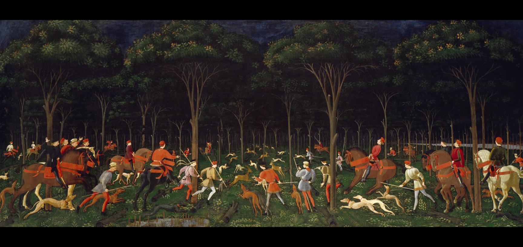
Uccello, 'Hunt in the Forest', c.1470

THE HUNT IN THE FOREST | Ashmolean Museum

My eye is immediately drawn to the vanishing point of the painting, because that is what the use of perspective here is designed to do. My eye follows the leaping hunting dogs into the rows of trees and beyond to where every figure is excitedly heading. Everything about this piece screams symmetry, from the way the trees are positioned to the depiction of the animals and humans. Uccello has even laid down tree stumps and branches on the ground to point the viewer in the direction of one point perspective. By using these foreshortened logs he is spelling it out to the viewer - here is the perfection of Renaissance painting. 

Although it may not be the most detailed painting in terms of the actual figures, everyone is at least doing something different. From the figures running into the trees to the men on horseback waving their arms to point the way for the viewer and the other hunters, this is a painting of movement and excitement. You can almost hear the cry of the dogs and calls of the men as they shout to one another for encouragement, firing the dogs into a frenzy in preparation for the meat they are about to catch. Furthermore, the viewer has a panoramic view of the forest, which not only involves them more fully within the painting but intrigues them as to what is occurring in the distance. Uccello has used a colour palette that goes from light to dark, meaning the viewer is being drawn into the darkness, making them ask questions about what is out there. Will this party be successful in their hunt? Or is this actually just a false alarm, and nothing will be caught at all? There is not just excitement in this painting, but there is intrigue. And this links back to the use of perspective. 

Uccello was a master of linear perspective, and this painting is a great example, linking closely with the design of the perhaps more famous The Battle of San Romano. There the viewer sees not logs but lances to mark the perspective. Equally in the painting above Uccello has created that grid-like pattern to show his talent as an artist. Although Uccello may have glorified the hunt somewhat here, it does not lack emotion and drama. But with the dark sky and rolling clouds coming in, perhaps Uccello is foreshadowing an unsuccessful hunt after all.  

Comments

Popular posts from this blog

Nicola Pisano, 'Adoration of the Magi', Pisa Baptistery Pulpit Panel

  In this complex, lively, exciting pulpit panel the eye looks up towards the monumentality of the Virgin, who commands this scene. She is massive and powerful, the largest figure with thick swathes of drapery delineating her forcefully protruding knees out into the viewer's space. Seated but still retaining dominance, she defines the classicising style of Nicola Pisano, witnessed throughout the panels of his pulpit in Pisa. Many writers have described the style - Eloise Angiola for instance, refers to the 'sophisticated understanding of classical prototypes to create heroic human forms' in Nicola's pulpit. Certainly in Pisa the prominent debris from the classical past remained visible and Nicola easily had access to various ancient sarcophagi for direct emulation here. The Virgin's features with her serene expression and curled hair beneath the mantle are in fact quite androgenous. She quickly assumes the position of a monumental Roman Emperor or Senator commanding

Marianne von Werekin, 'Sunrise', 1920

  An endless line of men that tug the rope of a small boat soon disappear into murky, burning red waters beyond. Colour is fantastical, mystical and otherworldly, producing an atmosphere far from reality. This is the Symbolist work of Marianne von Werefkin, part of the German Expressionists that worked in Munich from the 1910s. A movement so often dominated by the male names of the time – Kandinsky especially – Werefkin was a vital participant, expanding the range of art produced and displayed, complementing her work with art theory and written sources, as well as creating her own Salon upon her arrival in Munich. It is easy to get lost in biography with a piece such as this. Wasted, human potential seems to be at the heart of this work, signalled by the endless line of men pushing forward towards the edge of the picture plane. There is a sense of struggle and a universality to the suffering through the portrayal of faceless men in similar blue tones. Looking at the date produced of 19

Mark Rothko, 'Light Red over Black', 1957

  My eye is not drawn to the painting itself but the title of the painting, 'Light Red Over Black'. We would automatically think that the black is on top of a red background, but Rothko has flipped this around, subverting the title just like he subverting the meaning of what it was to be an artist and what Art actually was. During this time, art was going through rapid changes, with abstract expressionism coming into full force (Rothko, Pollock). But Rothko showed that all this change was for the good, even if for him, it was short lived.  The colour red in this painting is searing and the black struggles to fully cover this velvety border, especially at the bottom of the canvas. Unlike the black squares which have a hazy quality to their edges, the red is clear and impregnable. It is hard to figure out what this represents - the Tate has suggested a window perhaps, but if it is a window then what are we looking out into? Perhaps it is night, or perhaps the viewer is catching a