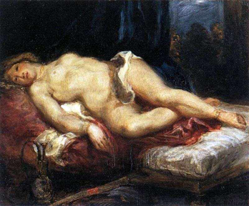
Delacroix, 'Odalisque', c.1825

 Odalisque by Eugene Delacroix

My eye is drawn to the dirty folds of drapery across her hips – they are supposed to cover her yet simply accentuate her nudity. The loose strokes and curving lines look agitated, at odds with the mood of the scene. It almost looks like a hand and arm attempting to grab her. The picture is titled ‘Odalisque’ suggesting a depiction of a harem, an image of languid, Eastern sensuality, a very popular subject throughout the nineteenth century. To a certain extent Delacroix conforms: the setting is dark and enclosed, and the woman seems drowsy, her body relaxed into sensual curves. The pale, soft flesh dominates the canvas, her torso shaped by the dark shadows beneath. There are just enough foreground details to establish that this is an Eastern scene and so the woman is not Venus, or a Parisian contemporary.

But my first impression of the drapery lingers and makes me uneasy. The woman’s position starts to look awkward. Her hip and pelvis are almost thrust upward, making them the highest point of the painting, whilst her neck and head are slumped lower, perhaps in a deliberate effort to get her facing the viewer. The awkwardness is not the relaxation of sleep but the unnatural limpness of unconsciousness or death. There is something about her gaze that is unseeing. She appears to be looking out at the (presumably male) viewer but Delacroix has painted her eyes as black holes, like a void in the canvas almost as if she is in a death-like swoon. Her slightly parted lips could be read as sensuality, but equally, she seems to have a complete lack of control or agency.

The whole painting is dishevelled - the loose brushwork of the drapery and the imprecise outline of the figure – both suggesting what has gone on before. The dominate colours – grubby red and white reference flesh and blood. And there is a vague threat in the dark background with the silhouetted shapes visible through the doorway. There is nothing decorative about this, none of the patterns or richness that you might expect in an odalisque painting, and no warmth. It’s all about darkness, imprisonment, seediness.

Comments

Popular posts from this blog

Nicola Pisano, 'Adoration of the Magi', Pisa Baptistery Pulpit Panel

  In this complex, lively, exciting pulpit panel the eye looks up towards the monumentality of the Virgin, who commands this scene. She is massive and powerful, the largest figure with thick swathes of drapery delineating her forcefully protruding knees out into the viewer's space. Seated but still retaining dominance, she defines the classicising style of Nicola Pisano, witnessed throughout the panels of his pulpit in Pisa. Many writers have described the style - Eloise Angiola for instance, refers to the 'sophisticated understanding of classical prototypes to create heroic human forms' in Nicola's pulpit. Certainly in Pisa the prominent debris from the classical past remained visible and Nicola easily had access to various ancient sarcophagi for direct emulation here. The Virgin's features with her serene expression and curled hair beneath the mantle are in fact quite androgenous. She quickly assumes the position of a monumental Roman Emperor or Senator commanding

Marianne von Werekin, 'Sunrise', 1920

  An endless line of men that tug the rope of a small boat soon disappear into murky, burning red waters beyond. Colour is fantastical, mystical and otherworldly, producing an atmosphere far from reality. This is the Symbolist work of Marianne von Werefkin, part of the German Expressionists that worked in Munich from the 1910s. A movement so often dominated by the male names of the time – Kandinsky especially – Werefkin was a vital participant, expanding the range of art produced and displayed, complementing her work with art theory and written sources, as well as creating her own Salon upon her arrival in Munich. It is easy to get lost in biography with a piece such as this. Wasted, human potential seems to be at the heart of this work, signalled by the endless line of men pushing forward towards the edge of the picture plane. There is a sense of struggle and a universality to the suffering through the portrayal of faceless men in similar blue tones. Looking at the date produced of 19

Mark Rothko, 'Light Red over Black', 1957

  My eye is not drawn to the painting itself but the title of the painting, 'Light Red Over Black'. We would automatically think that the black is on top of a red background, but Rothko has flipped this around, subverting the title just like he subverting the meaning of what it was to be an artist and what Art actually was. During this time, art was going through rapid changes, with abstract expressionism coming into full force (Rothko, Pollock). But Rothko showed that all this change was for the good, even if for him, it was short lived.  The colour red in this painting is searing and the black struggles to fully cover this velvety border, especially at the bottom of the canvas. Unlike the black squares which have a hazy quality to their edges, the red is clear and impregnable. It is hard to figure out what this represents - the Tate has suggested a window perhaps, but if it is a window then what are we looking out into? Perhaps it is night, or perhaps the viewer is catching a