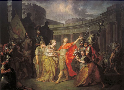
After the introduction of Classical training through teaching at Russia's Academy of Arts opening in 1764, works such as Losenko's Farewell of Hector and Andromache began to be produced, imitating Western modes. The eye is instantly aware of the Classical lighting with which the artist has imbued this piece, a heroic glow illuminating the contrapposto stance of Hector who flings his outstretched arm upwards towards darkening clouds. Dressed in neoclassical attire, even one who is less familiar with the story can grasp the military connotations of the event, as Hector prepares for battle. Clearly, the storm brewing is a threatening symbol, implying his resulting death after the events depicted in this scene. Hector's tilted face is one of anguish and torment, his brow furrowed, his expression pained and confused. Beside him his wife, clutching their infant son, is slightly more contained in her emotions. Perhaps Losenko has relegated the emotional strength of the piece solely to the male hero. But including Andromache in the glorious lighting shows Losenko has not completely neglected her importance in the story. Similarly to Hector's rippling cloak, Andromache's heavy draperies present an opportunity for the artist to show off his technical skill, whilst also using her maternal embrace of her son to add sentimental weight to the narrative.
Losenko was heralded as the 'new Raphael' in Russia, and pioneering history painting in this otherwise backwards community of native artists. Without any form of artistic training, the professional artist did not exist in Russia as it did in Europe, and 'artists' were icon painters if nothing else. Heavy reliance on foreign artists produced royal portraiture, until Catherine the Great in the mid eighteenth century saw the need to create a native, national style for the Russian Empire. Thus, the Academy was born, and artist such as Losenko rose to prominence through their skill in emulating the West and antiquity. The subject chosen was already popular in Europe and would continue to be, represented by the works of Antonio Zucchi and David. Training at Russia's Academy of Arts followed French models, for instance drawing from live models. The stance of Hector could easily have been posed by a life model in the training studios of Russia's Academy.
Striking in the piece is Losenko's capacity for detail. The Doric columns with, according to Vitrivius, connotations of masculine strength, are topped by triptychs, metopes and relief work featuring heraldic, military imagery. This circular stage set behind the figures serves to push them forward towards the viewer's space, however Losenko is careful to leave enough room at the front of the composition so as not to overwhelm the viewer's eye. Compositionally therefore, this piece is one of harmony and balance. This would become an issue for subsequent Russian paintings also depicting narrative and biblical scenes, such as the overblown Romanticism of Karl Briullov and Fydor Bruni. The secondary figures relegated to the shadows in Losenko's work echo the curve of the classical architecture, again enticing the viewer to analyse the painting more closely. Each time you look, there's another detail to be discovered, from the rearing horse in the background to the figure struggling under the weight of Hector's shield close to the edge of the picture plane. It is a painting that merits close analysis and highlights how Losenko was emulating the best of what European painting had to offer.
Comments
Post a Comment