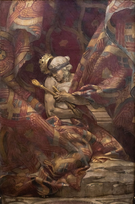
So often is John Singer Sargent defined by his society portraits
which from the late 1870s, gave him international fame, a distinct style and
elite client opportunities. The recent exhibition at Tate Britain successfully
defined the artist through 'fashion' and his upper-class portraits with their
quick, confident brushwork and equally commanding figural depictions. Studied
less often, however, are the mural works by Sargent at Boston's public library which
took the artist three decades to accomplish. The allegorical figure of
the Synagogue, a particularly controversial design, seems to
have been produced by a different artist entirely. Gone is the elegant pose
of Madame X, or the sumptuous clothing of Madame Subercaseaux
reclining at her pianoforte, or even the engaging, demur stare of Lady Agnew of
Lochnaw. Sargent instead portrays an allegory turned in on itself and away from
the viewer, swaddled in orientalising, claustrophobic folds.
Sargent's sources are very clear here, and contemporaries remarked
on his intellect and careful study of other cultures, travelling extensively to
consult artistic monuments. The artist himself, according to Sally Promey,
explained the link between his murals and sculptural reliefs by drawing on the Gothic
medievalism at Reims and Strasbourg. Certainly, Sargent brings a sculptural quality
to not only the stony pallor of the figure's skin, but the muscularity of the
arms and hands. Equally, it brings to mind the murals of Michelangelo at the
Sistine Chapel and more specifically his sibyls. The broad shoulders and
muscular hands of the Cumaean Sibyl seem to be particularly
influential to the creation of Sargent's own allegory. Therefore, the artist in
question was highlighting his ability to synthesise sources, Medieval and
Renaissance, to produce a unique allegorical figure. Additionally, he was dealing
with the constraints of a barrel vaulted interior on the library's uppermost
floor. Once more he recalled the Renaissance artists who frescoed monumental
interiors, including Giotto in the Arena Chapel (another barrel vaulted
interior). Sargent was exploring spatiality and the rendering of figures
through foreshortening and depth, whilst also looking to create a unique and
expressive allegorical image.
As a portrayal of the Synagogue, the work was not
without controversy. The artist chose to position the allegorical figure
opposite a depiction of Hell. It seems likely this was a deliberate
dialogue and sightline, as was often the case in barrel vaulted interiors -
again, Giotto's Arena Chapel is a key example of this coincidentia
oppositorum or confrontation of meaningful opposites. Furthermore,
the Synagogue was seen to juxtapose the personification of
the Church beside it. A brief comparison highlights this: the
youthful, graceful, angelic-like Church juxtaposed with the
aging Synagogue, unbalanced, with twisted limbs squashed
tightly together and most importantly, unseeing through the inclusion of the
blindfold. Within the context of early twentieth century America concerning
immigration debates and increasingly anti-Semitic prejudices, Sargent's
allegory was conceived as a negative, demoralising portrayal of the Jewish
religion. A hearing in 1922 considered the removal of the work and two years
later it was splashed with ink. This resulted in the stationing of a guard
beside the image within the public library space.
Yet, if a viewer judges the image on an aesthetic, formal basis,
they see a truly original and interesting depiction. The palette is muted, the
composition claustrophobic and it is only made three-dimensional by the thick
rolls of fabric that reveal the figure. There is movement, drama, action and
emotion, despite the fact that the figure's face is tucked away. The crown
slipping off the head of the Synagogue is particularly
effective in this regard, catching the light as it topples. The turned head of
the figure almost gives the sense that she has shook the crown off herself, but
blindfolded she cannot see the true effect of this movement. Sargent's work is representative
of a host of artists from the time, both in America and Britain, who were working
in this fantastical, fin de siècle vein. Angelic, mystical beings in a
controlled, ephemeral colour palette followed on from the
Pre-Raphaelites and began to permeate the work of artists including
G.F Watts. Many of the artists working during this period also shared the goal
of mural painting itself, which they believed to be superior to portraiture.
Sargent's oeuvre needs to be opened up and expanded from
'society portraitist'. His creation of unique allegories and personifications
have a wealth of potential meanings which deserve to be unpicked.

Comments
Post a Comment